Posts

Final Reflection

Image
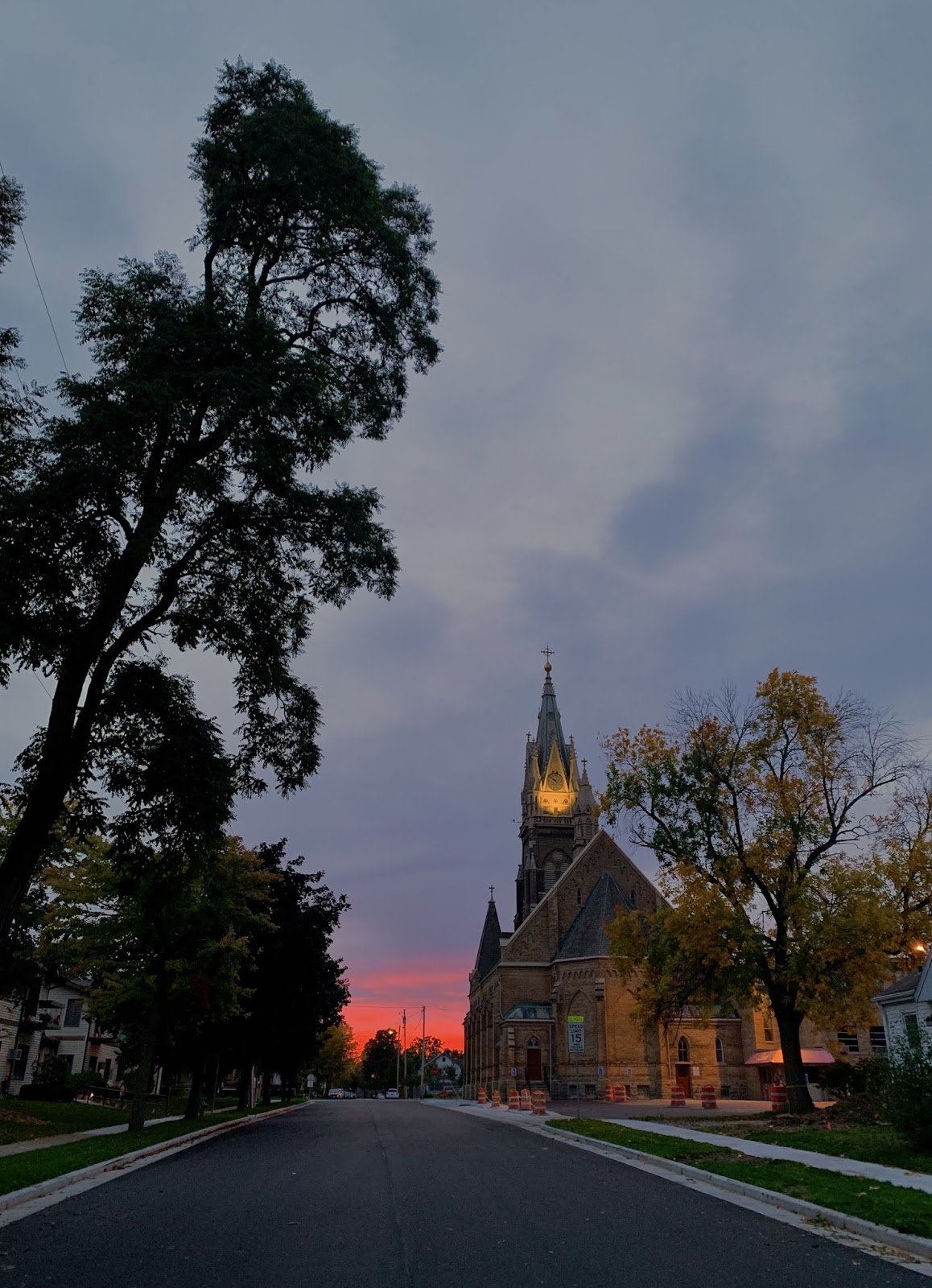
 Although the asynchronous format of the class and my own procrastination were challenging this term, I enjoyed the opportunity to dive back into my artistic side and work to develop my own eye and sense of style. I mainly stuck to photography for the assignments, and began by photographing scenes the way I was used to seeing them. As you can see in one of my first photographs for the class, I focused on composing a landscape but didn't necessarily hone in on a particular design element. It took a while for me to start capturing design in a more specific sense, and often meant getting closer to my subject. Sometimes, finding a particular design element to capture or create was difficult, but provided a good limitation that expanded creativity and pushed me to think outside the box. The work sometimes felt like just an exercise, but throughout the course of this term I noticed a greater depth to my images and an expansion of my sense of composition and design.  Sharing the images to

Time and Motion

 This assignment brought me somewhat outside the objectives laid forth by Lupton and Phillips, although I did try to embody their idea that "it can be useful to think about the screen as an active, changing surface as well as a neutral stage or support." (233) As I drove the 8 hours round trip to pick up my brother from Macalester College in Saint Paul, MN, I shot some footage of the drive with the attempt of sharing the feeling of the slow passage of time along the journey. I used longer, static shots to highlight the landscape and turn the screen into the driver's perspective, rather than focusing on characters. I also made a soundtrack by playing a couple chords through a synthesizer in Logic that I felt gave the video a melancholy but peaceful feel. I used color correction in Final Cut to give the clips a blue-ish, darker tint as well. I would definitely liked to have made a longer video, and I plan on coming back to this idea over winter break. instagram link:  insta

Diagram

Image
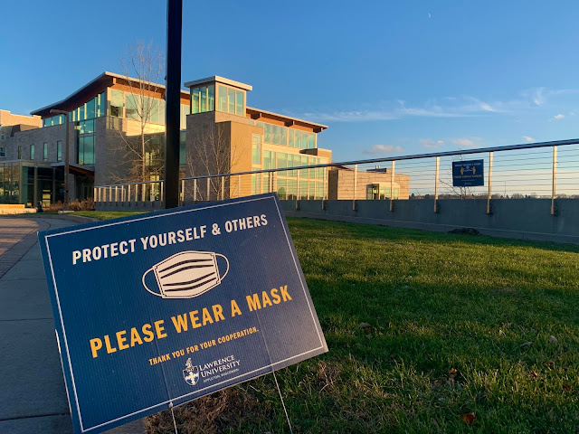
 I originally thought that diagrams would be easy to find for this assignment, though I soon realized that I wanted to capture diagrams that interacted with their environment. This proved to be a more challenging task, as most diagrams are fairly self-contained and only apply to the narrow task or process that they depict. Lupton and Phillips include that "Graphic marks and visual relationships take on specific meanings, coded within the diagram to depict numerical increments, relative size, temporal change, structural links, and other conditions." (215)  I decided to photograph two signs that serve as diagrams for our current Covid-adapted world, and serve to designate the new normal of social distancing and mask-wearing. The tilt of the first sign makes it look like it has been in its place for a long time, and speaks to the pandemic's longevity and persistance. These diagrams have encouraged safety, but also restricted our environment and provide a constant reminder of

Modularity and Pattern

Image
A bike ride on Election Day led me around the northern fringe of Appleton, on an unseasonably warm and strange day. It was much quieter than the tense media coverage would suggest, and I found myself drawn to the uniform and bland suburban landscape with its miles and miles of identical houses. One row in particular stood out as an example of modularity and pattern. Being on the bike path allowed me to capture the houses from behind a hill, removed from the context of a street with driveways and cars. This further emphasized the repetitive pattern of the design. I also edited the photo to give it a more vibrant, retro look. Instagram link:  https://instagram.com/bennetts_artjournal?igshid=11l8ifs5x8ud7

Transparency and Layers

Image
Transparency and layers were difficult to capture for this assignment, and I was less satisfied with my results for this project compared to previous ones. I ended up shooting photos around Wisconsin Avenue, near my apartment. Wisconsin Ave has a much more casual and old-school feel than College Ave, and it was fun to capture scenes that seemed frozen in time. The photos taken through the car and shop windows exemplify transparency more than anything else, while the photo taken through the fence brings layers into the equation with the signs suspended by the fence. Lupton and Phillips state that "transparency becomes an active design element when its value is somewhere between zero and 100 percent." (pg 155) I tried to examine how light and reflection played into the transparent surfaces, with mixed success. In the photo of the shop window, the window becomes a canvas for the drawn-on jelly bean designs and highlights with sunlight the wares on display. I was especially drawn

Framing

Image
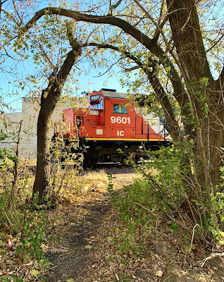
To me, framing in an image contextualizes the contents of the image and gives them new meaning. When I set out to complete this assignment, I tried to embody a quote from the Lupton-Philips text that reads, "the frame is subservient to the content it surrounds, disappearing as we focus on the image or object on view, and yet the frame shapes our understanding of that content." (p117) I originally planned on focusing on framing through buildings or windows, but as I started to cross the train tracks near my apartment, I noticed a train coming in the distance. When I stepped back to let the train pass, I realized that the trees on the side of the tracks formed an irregular and organic frame that contrasted with the rigid mechanical features of the train. Although the train was moving quickly, the strong sunlight enabled a quick shutter speed which makes the train look completely still. The trees give the image a more mysterious feel, and change the viewer's perception of an

Gestalt Principles

Image
This assignment proved to be the most challenging of the projects so far, in my opinion. Because I mainly work with photography, I had to challenge myself to manipulate the image I took in order to really embody the Gestalt principles. I tried to focus on the Lupton Philips quote that reads "designers crop, overlap, and fragment images to create dynamic forms that exploit the brain's powerful ability to fill in missing information." I first edited the self-portrait I took to isolate solely the form of my head, upper body and trombone. This created an abundance of negative space in the image that allowed the text to capture more of the viewer's focus. I chose to create a concert poster because musicians like myself haven't been able to play shows for live audiences in months. Sharing music with others is a large part of identity, and I wanted to tap into that facet of my life through this project. Instagram link:  https://www.instagram.com/bennetts_artjournal/